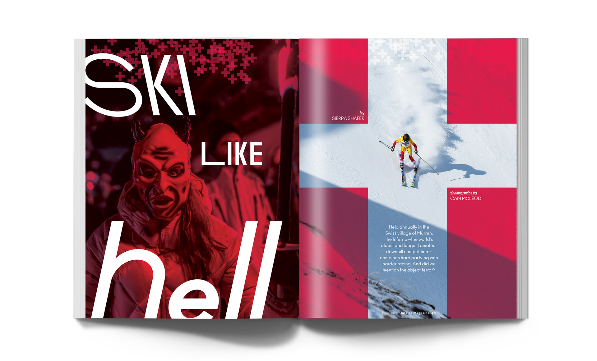
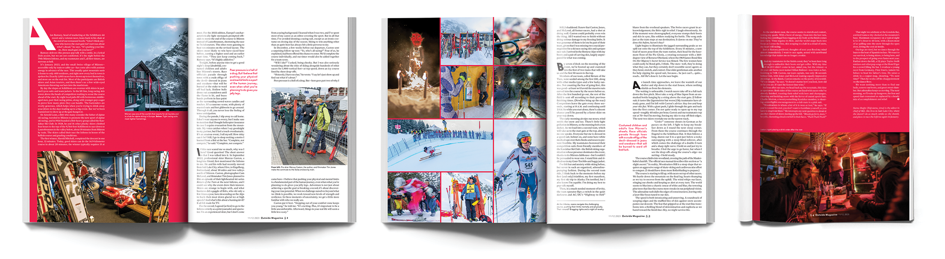
BEHIND THE DESIGN: Ski Like Hell is an annual ski race that takes place in the Swiss village of Mürren. The Inferno is a one-of-a-kind event that combines the thrill of hard partying with the challenge of a severe downhill race. The color red, a symbol of the Swiss flag, is used to represent the race's wild and adventurous spirit. The font I've chosen for the head and drop caps is deliberately skewed left and right, mirroring the exhilarating movement of a skier going downhill. Additionally, the wide gutter width is a deliberate choice, symbolizing the expansive piste or ski run that the racer from the opening spread will navigate throughout the feature.
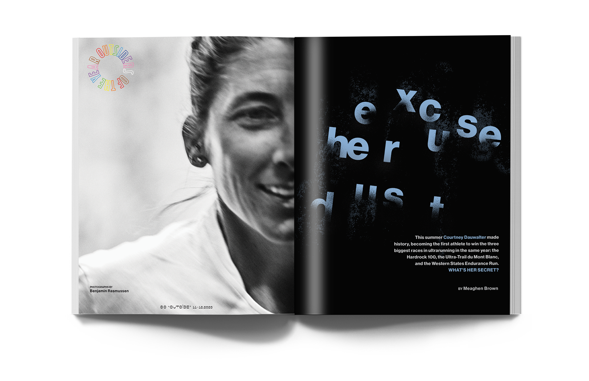
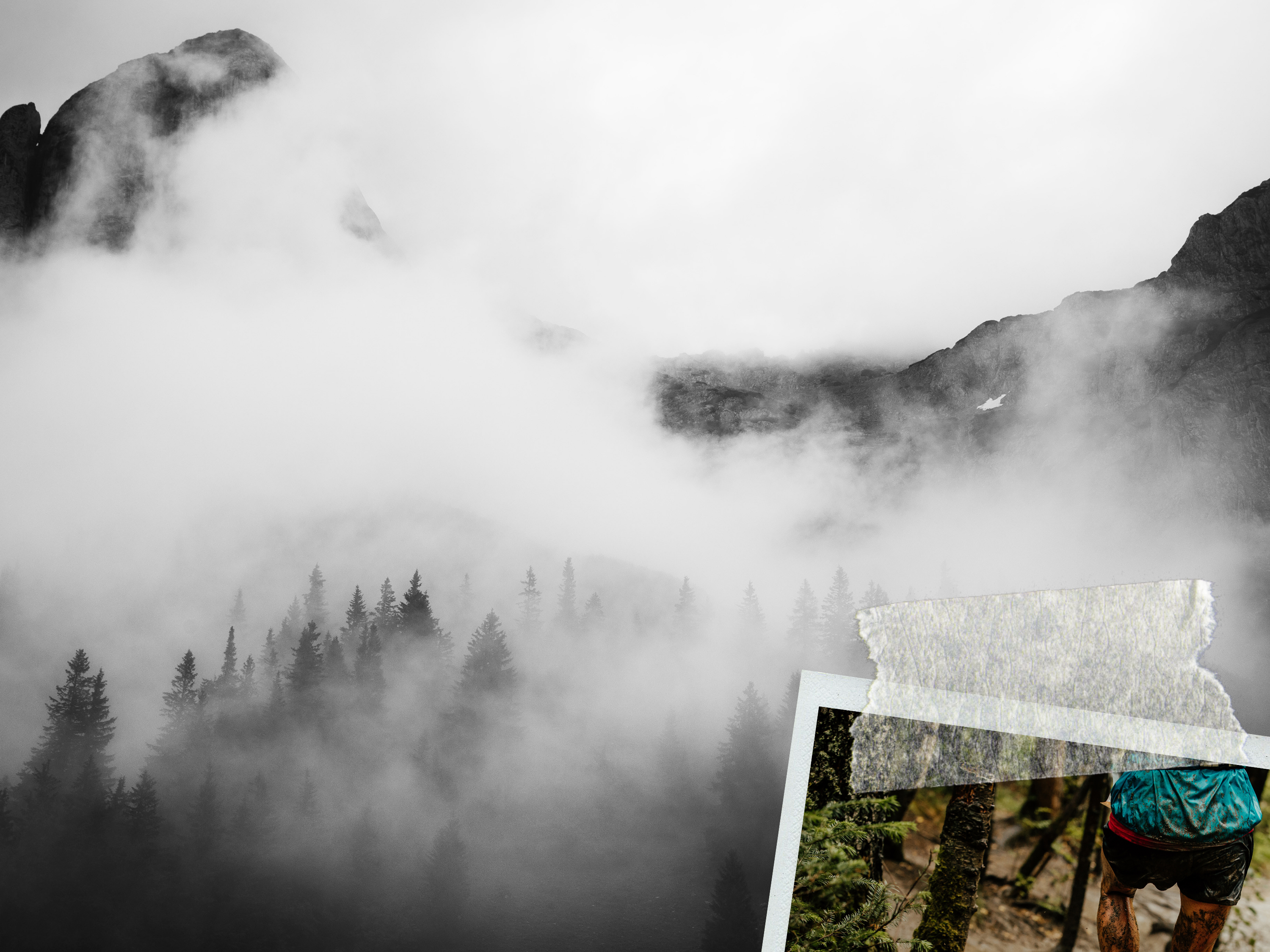
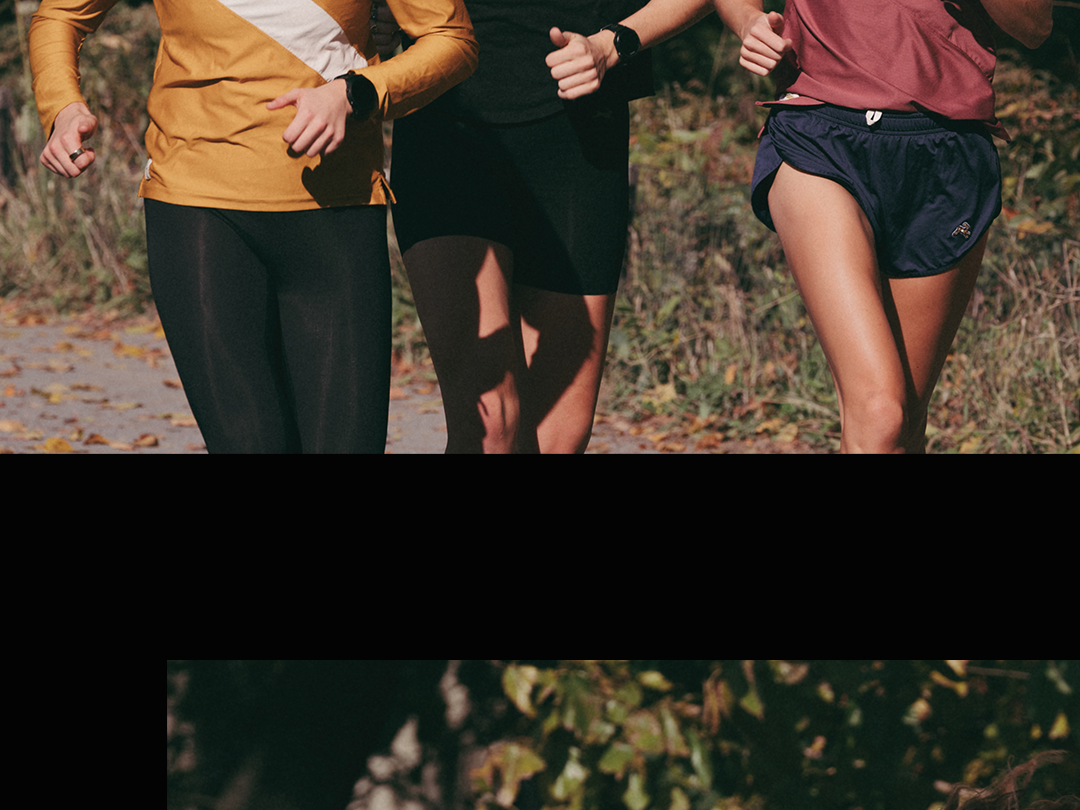
BEHIND THE DESIGN: The movement of the letters reflects Courtney's exceptional trail running crazy mountains, while the disappearing letters symbolize how she leaves her competitors in the dust.
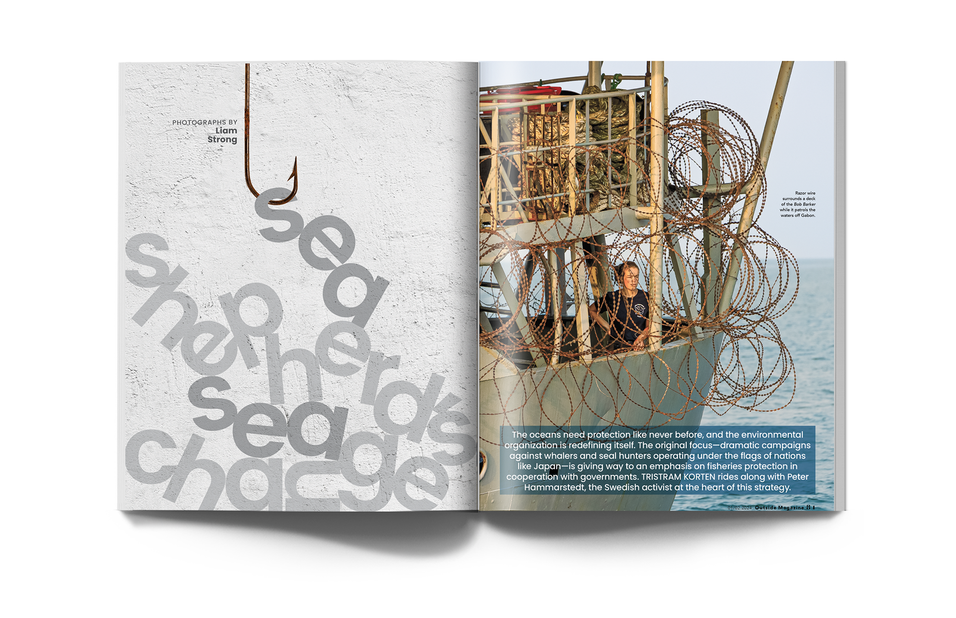
BEHIND THE DESIGN: The letters in the main head creatively symbolize the fish caught by the troller.
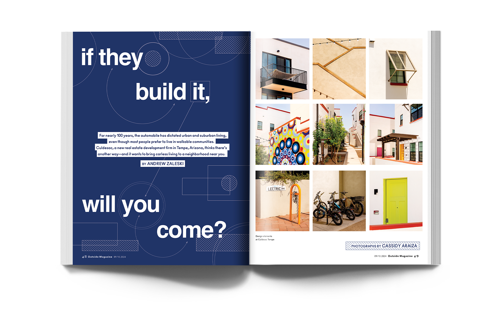
BEHIND THE DESIGN: At the heart of this story is a simple but powerful idea — what does it mean to design a community around people, not cars? Set in Tempe, Arizona, the blueprint became my guiding design element, a nod to the careful planning that shapes walkable neighborhoods. The photography aligned naturally, mirroring the rhythm and intention of the walkable paths.
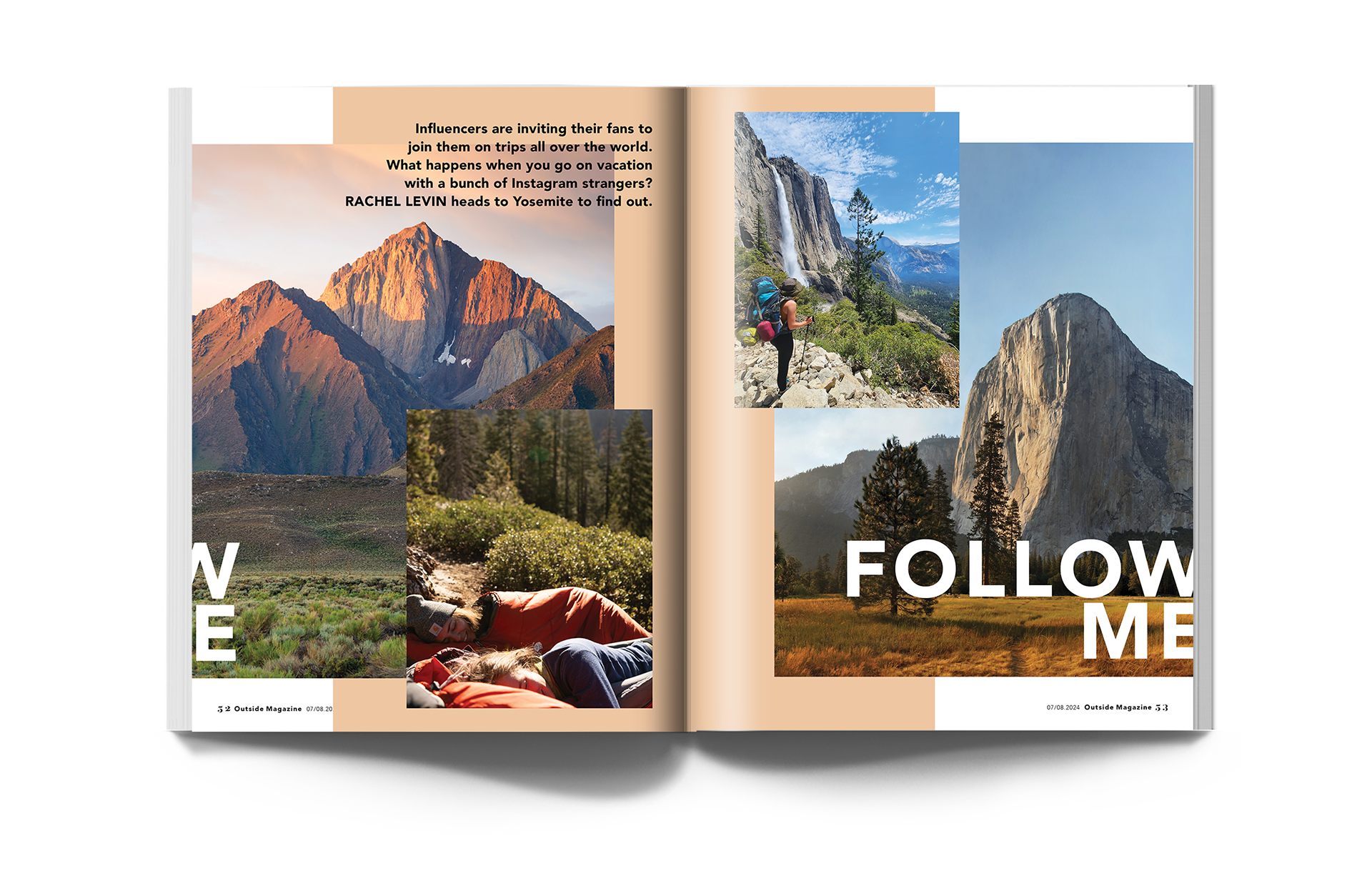
BEHIND THE DESIGN: The layered photography and broken headline were designed to mirror the scroll of an Instagram carousel — because when your story is about influencers inviting fans into their travels, the design should feel like the platform itself.
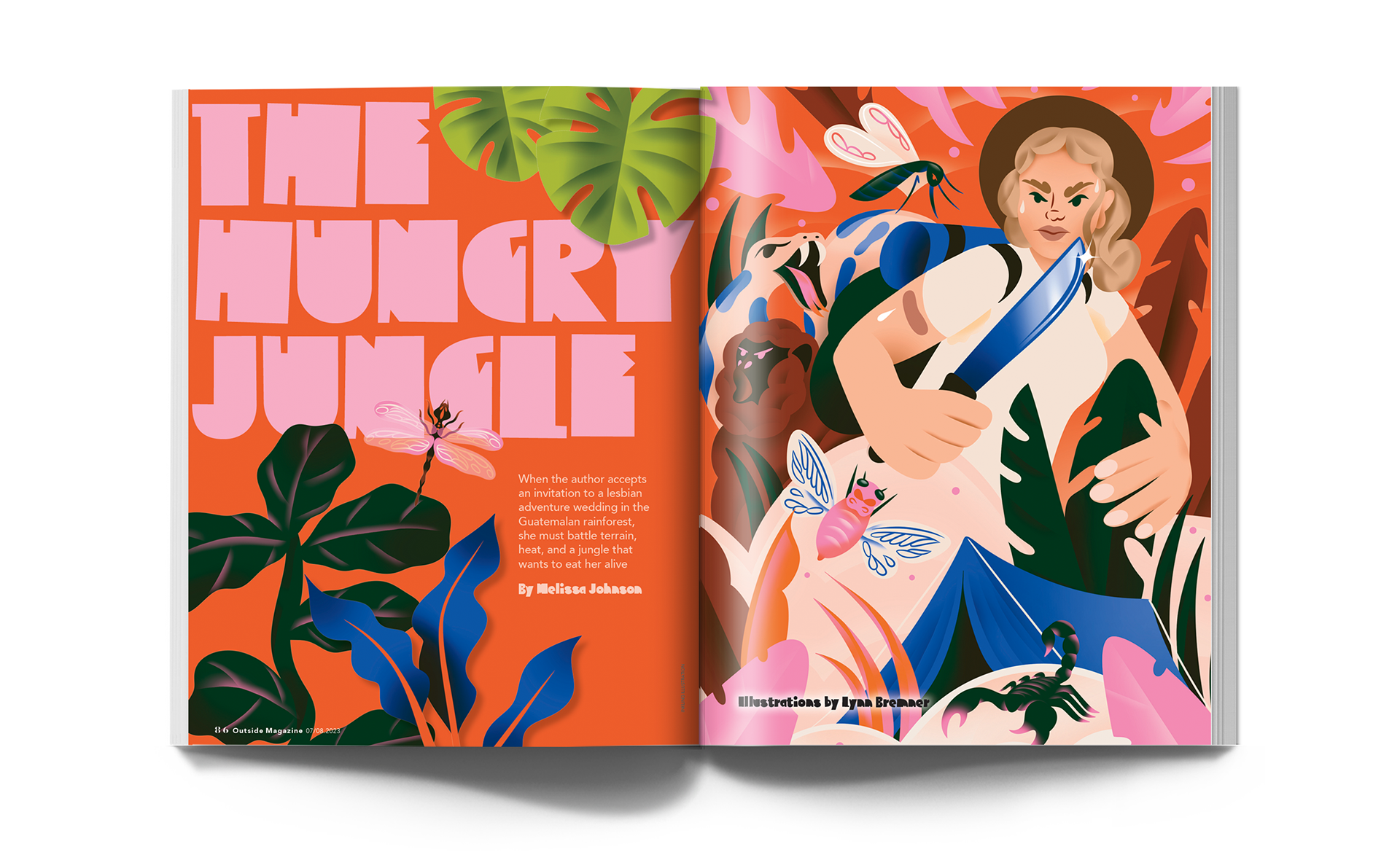
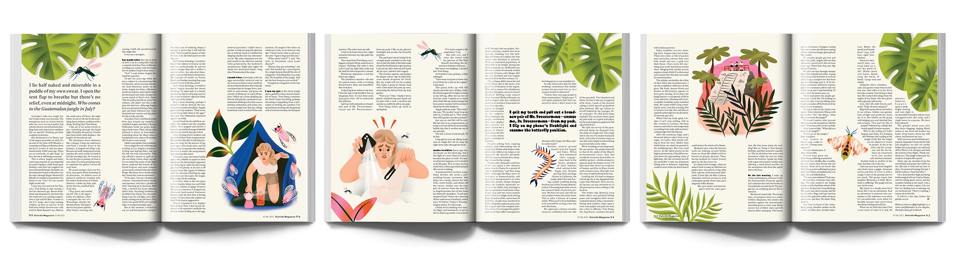
BEHIND THE DESIGN: Hired the wildly talented Lynn Bremner to illustrate this entertaining story. I love Lynn's color palette; it is so unexpected and lively, which brought this story to life.
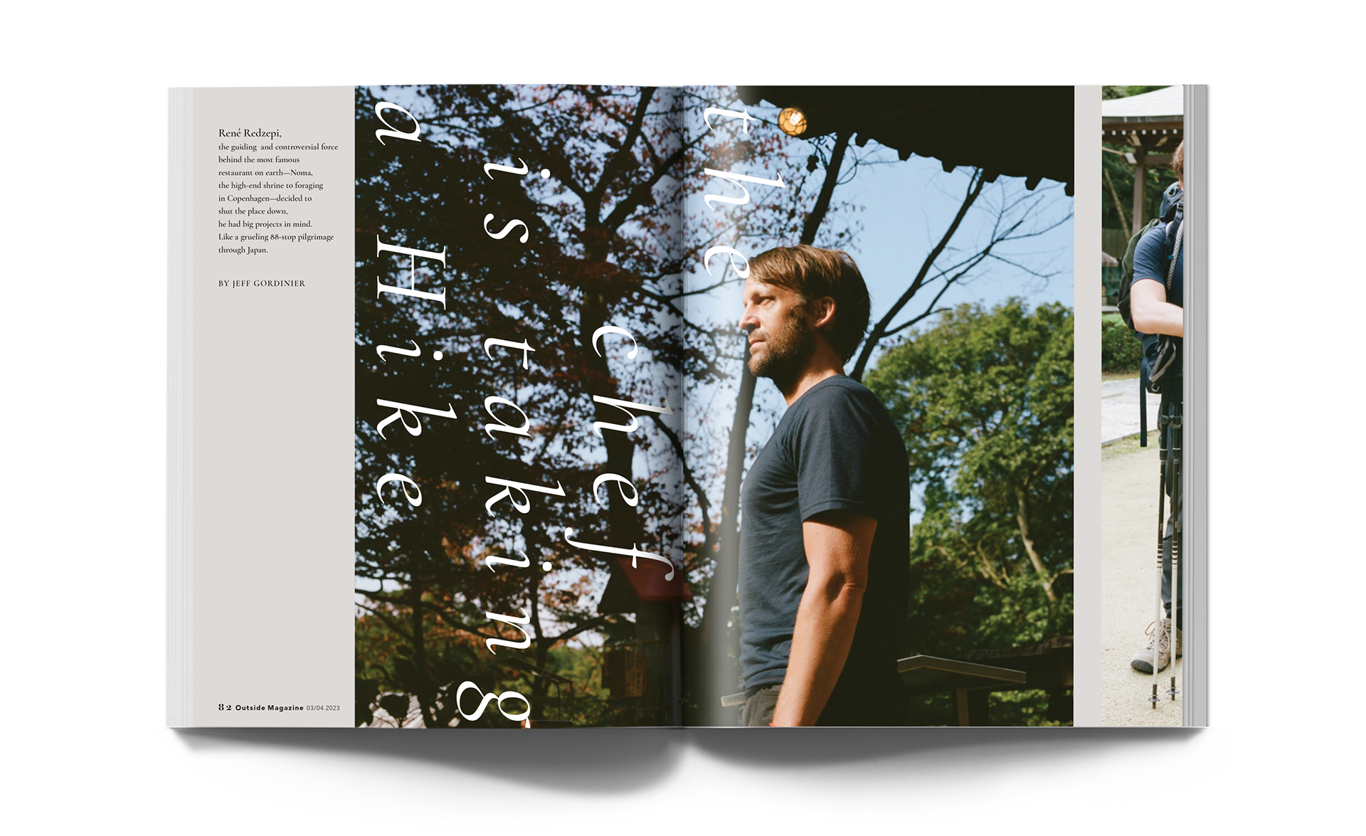
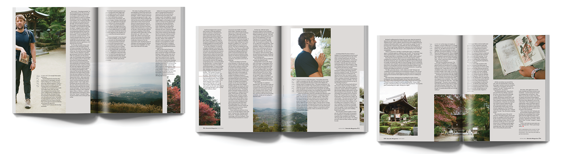
BEHIND THE DESIGN: The varying lengths of the columns are intended to convey a sense of movement, reflecting the chef's hike in Japan. Text flowing over images adds texture, while cutting images and continuing them on the next page creates an effect similar to folding paper in origami.
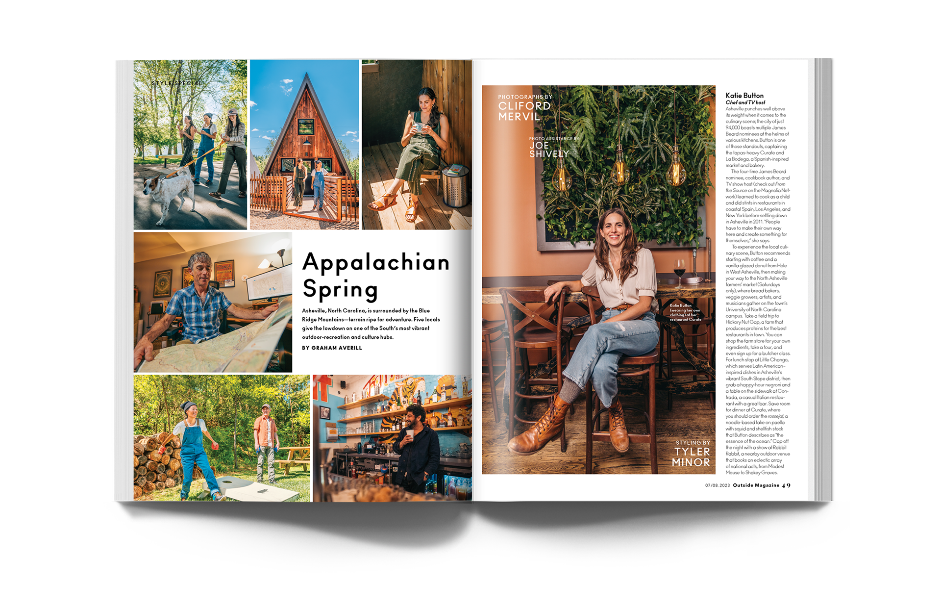
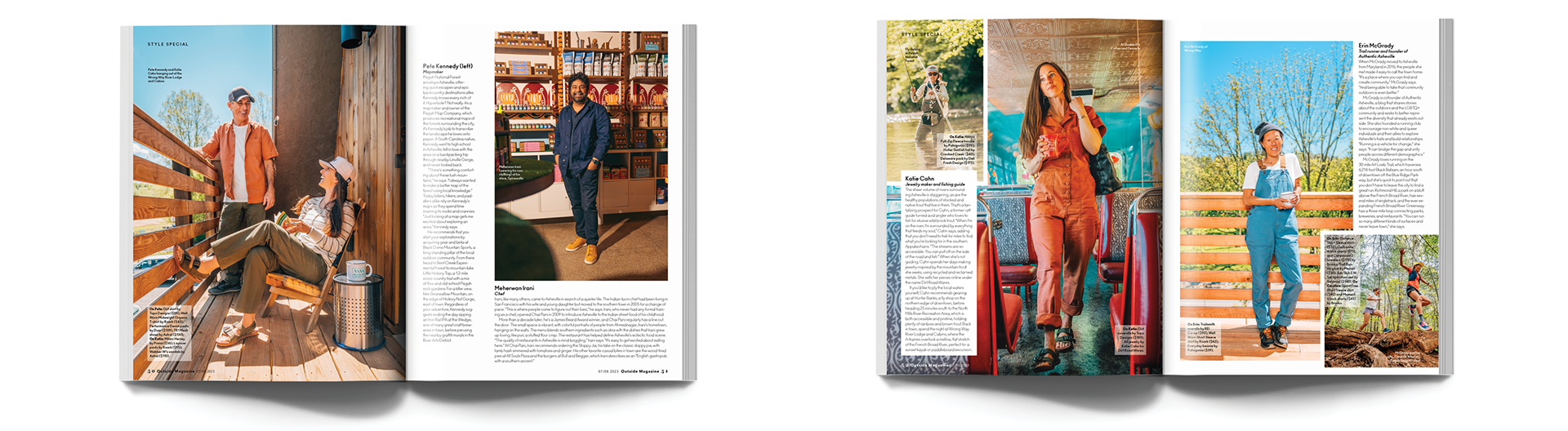
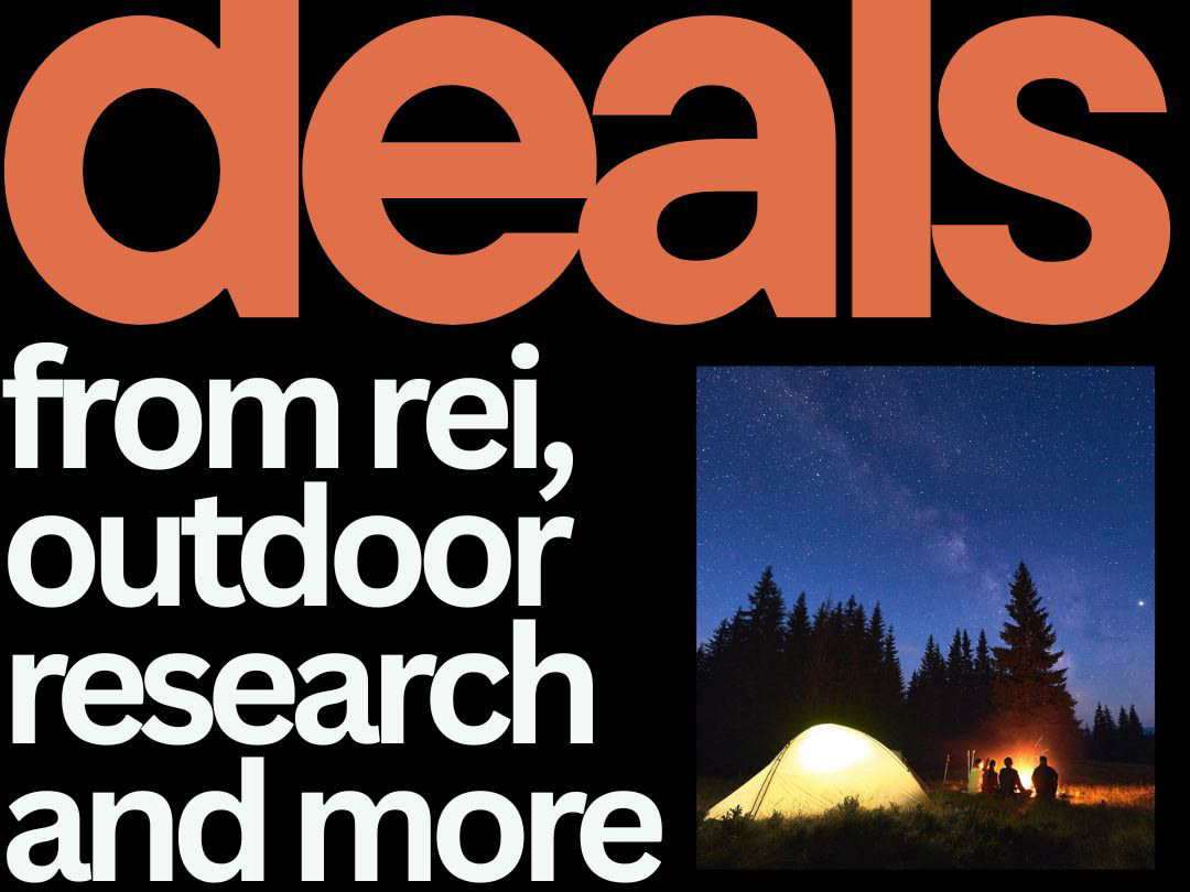
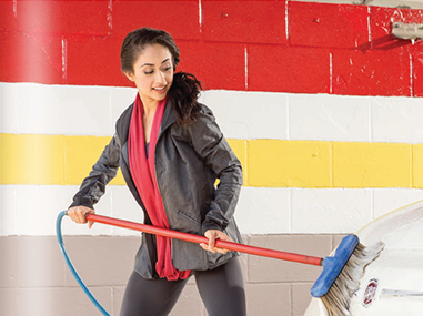
Gear shoot in Asheville celebrating the craftsmanship and innovation of small business owners.
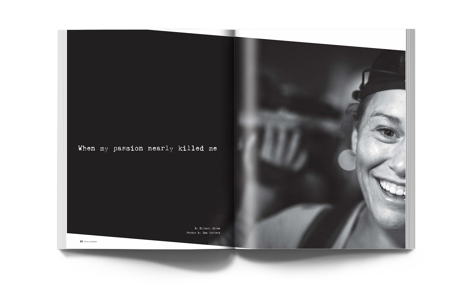
Openers for Trail Runner magazine.
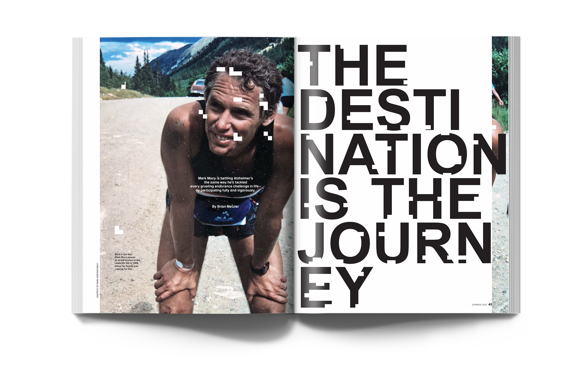
BEHIND THE DESIGN: The left opener captures a runner's slow descent into dementia, with fragmented images symbolizing the author's fading memories. The right opener depicts a harrowing near-death fall during a trail race, with the tilted image mirroring her plunge off a cliff.